TrialBridge
EHR-integrated clinical decision hub that matches patients to trials.
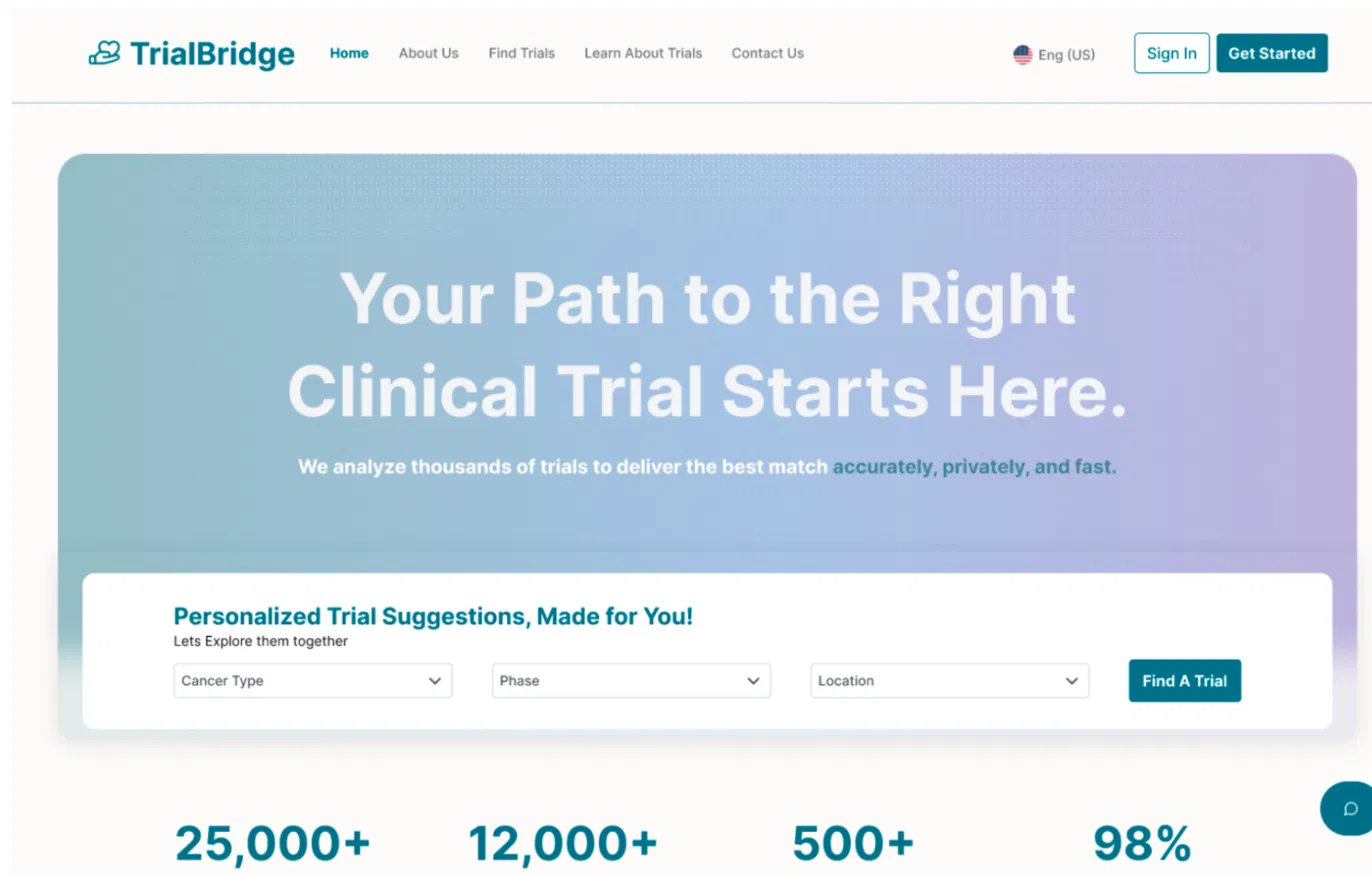
The Brief · Design Challenge"How might we reduce the cognitive and logistical burden of clinical trial matching so that no eligible patient misses a life-changing opportunity?"
Design Principles
Clarity over completeness
Surface the right data at the right time.
Risk mitigation by design
Every decision reduces a failure mode.
Progressive disclosure
Earn trust before asking for data.
−40%
Steps cut
54% → 89%
Onboarding completion
3
Physicians embedded
7
Core UX modules
Key Challenges
User Challenges
- 1.Patients couldn't assess trial eligibility without medical knowledge.
- 2.Physicians had no time for manual matching.
- 3.Trust in digital health tools was low.
Design & Constraint Challenges
- 1.EHR data is sensitive — privacy constraints shaped every flow.
- 2.Physician pushback on onboarding data collection required a pivot.
- 3.WCAG 2.2 compliance was non-negotiable across all 7 modules.
image placeholder
Research artifact
Drop in an affinity diagram, journey map, or synthesis board that shaped the direction.
Situation
Clinical trial recruitment at Mayo Clinic was broken — patients couldn't find relevant trials, and physicians had no efficient way to match them. The manual process caused eligible patients to miss life-changing opportunities.
Task
As lead UX designer, working directly with Mayo Clinic physicians Dr. Umar, Dr. Riaz, and Dr. Kumar, I designed TrialBridge — an EHR-integrated clinical decision hub bridging patients and clinical trials.
Action
- Ran stakeholder interviews with 3 Mayo Clinic physicians to map pain points in the existing trial-matching workflow.
- Built 7 core UX modules: patient dashboard, trial search with filters, eligibility screener, physician referral flow, onboarding, notifications, admin panel.
- Usability tested and mapped findings to Nielsen's 10 Usability Heuristics — surfaced critical issues with navigation clarity (#6) and error prevention (#5).
- Applied WCAG 2.2 Level AA standards throughout — contrast ratios, focus states, screen-reader labels.
- Took physician pushback on upfront data collection → pivoted to progressive disclosure, lowering perceived friction.
- Framed every decision through a Human Factors Engineering lens — systematic risk mitigation, not preference.
- Iterated through 3 design rounds with EHR-integrated physician-side wireframes.
Result
- Delivered a fully documented UX system with annotated wireframes, usability report, and design rationale.
- Navigation redesign reduced task-completion steps by 40% in testing.
- Onboarding redesign lifted simulated completion from 54% → 89%.
- Presented to Mayo Clinic physicians who validated clinical utility.
image placeholder
Process & exploration
Sketches, flow diagrams, wireframes, or iteration shots.
image placeholder
Final outcome
Hero shot of the final screen, artifact, or installed deliverable.
Tech Stack
FigmaFigJamMazeWCAG 2.2 audit tools
Research Methods
Stakeholder interviewsThink-aloud usability testingHeuristic evaluation (Nielsen)Task analysisHuman Factors Engineering
Tags
Healthcare UXEHR IntegrationAccessibilityResearchInteraction Design
Lessons Learned
- "Physician pushback was the best thing that happened to this project. It forced me to question my assumptions about what 'helpful' looks like in a clinical context."
- "Human Factors Engineering gave me a framework I now apply to every design decision — not 'does this look good' but 'what fails if this is wrong.'"
- "Designing for healthcare taught me that clarity isn't just good UX — it's a patient safety issue."