You can watch the video demo below to get a quick overview of the project before exploring the case study.
CASE STUDY · MAYO CLINIC · FALL 2025 · DSC 598
Trial
Bridge
Healthcare UX Design
An EHR-integrated clinical decision hub that matches patients to the right clinical trials — fast.
COURSE
DSC 598
CX Design in Healthcare
MY ROLE
Product Designer
PHYSICIANS
Dr. Umar
Dr. Riaz · & Dr. Kumar
INSTITUTION
Mayo Clinic
Arizona State University

01 — INTRODUCTION
Fewer than 5% of adult cancer patients participate in clinical trials. Not because they do not want to. Because the process is genuinely broken.
Physicians at Mayo Clinic were spending hours manually cross-referencing eligibility criteria against patient records outside their EHR system entirely. Trials went unfilled. Patients missed opportunities.
Working with Dr. Umar, Dr. Riaz, and Dr. Kumar in DSC 598, we designed TrialBridge — an EHR-integrated clinical decision support platform built around how doctors actually work. Stakeholder interviews, affinity mapping in FigJam, three concept iterations in Figma, think-aloud testing in Maze, and heuristic evaluation against Nielsen's 10 principles. Every decision pressure-tested through a Human Factors Engineering lens.
Seven modules. WCAG 2.2 throughout. Task completion down 40%. Onboarding completion up from 54% to 89%.
02 — THE PROBLEM
Eligible patients were missing life-changing trials.
< 5%
of adult cancer patients
participate in clinical trials
01
Information Overload
Disjointed trial registries with technical terminology made discovery nearly impossible for patients without medical backgrounds.
02
Physician Time Constraints
Doctors had no efficient way to match patients to trials. Manual cross-referencing took hours they didn't have.
03
Emotional Burden
Anxiety about safety, lack of caregiver support, and overwhelming complexity during an already devastating experience.
03 — MY ROLE
Lead UX Designer +
Researcher.
Stakeholder Interviews
Ran in-depth sessions with Dr. Umar, Dr. Riaz, and Dr. Kumar to map the exact pain points in the existing trial-matching workflow. Three physicians. Three different perspectives on the same broken system.
7 Core UX Modules
Patient dashboard, trial search and filters, eligibility screener, physician referral flow, onboarding, notifications, admin panel. Every module validated against real clinical workflow.
Human Factors Engineering
Every design decision framed through systematic risk mitigation — not preference. What fails if this is wrong? That question drove every iteration.
04 — DESIGN PROCESS
From research to refinement.
A systematic, stakeholder-driven process.
1
Research & Affinity Mapping
Individual brainstorming in FigJam, in-class sticky note sessions, group affinity mapping to cluster challenges and opportunities from comprehensive literature review.
2
Concept Ideation
Three distinct design concepts: patient-guided discovery, EHR clinical workflow integration, community-powered support systems. Each addressing a different root cause.
3
Stakeholder Co-Creation
Collaborative sessions with Mayo Clinic physicians via Zoom and in-class discussions. Validated clinical accuracy, emotional needs, and user flows directly with experts.
4
Iterative Prototyping
Low-fidelity screens covering the entire patient, caregiver, and physician journey. Refined through think-aloud testing protocols with clinicians and faculty.
5
Final Validation
High-fidelity prototype refined on physician feedback. Reduced cognitive load, improved clarity, strengthened privacy controls while maintaining clinical validity.
Research and Affinity Mapping
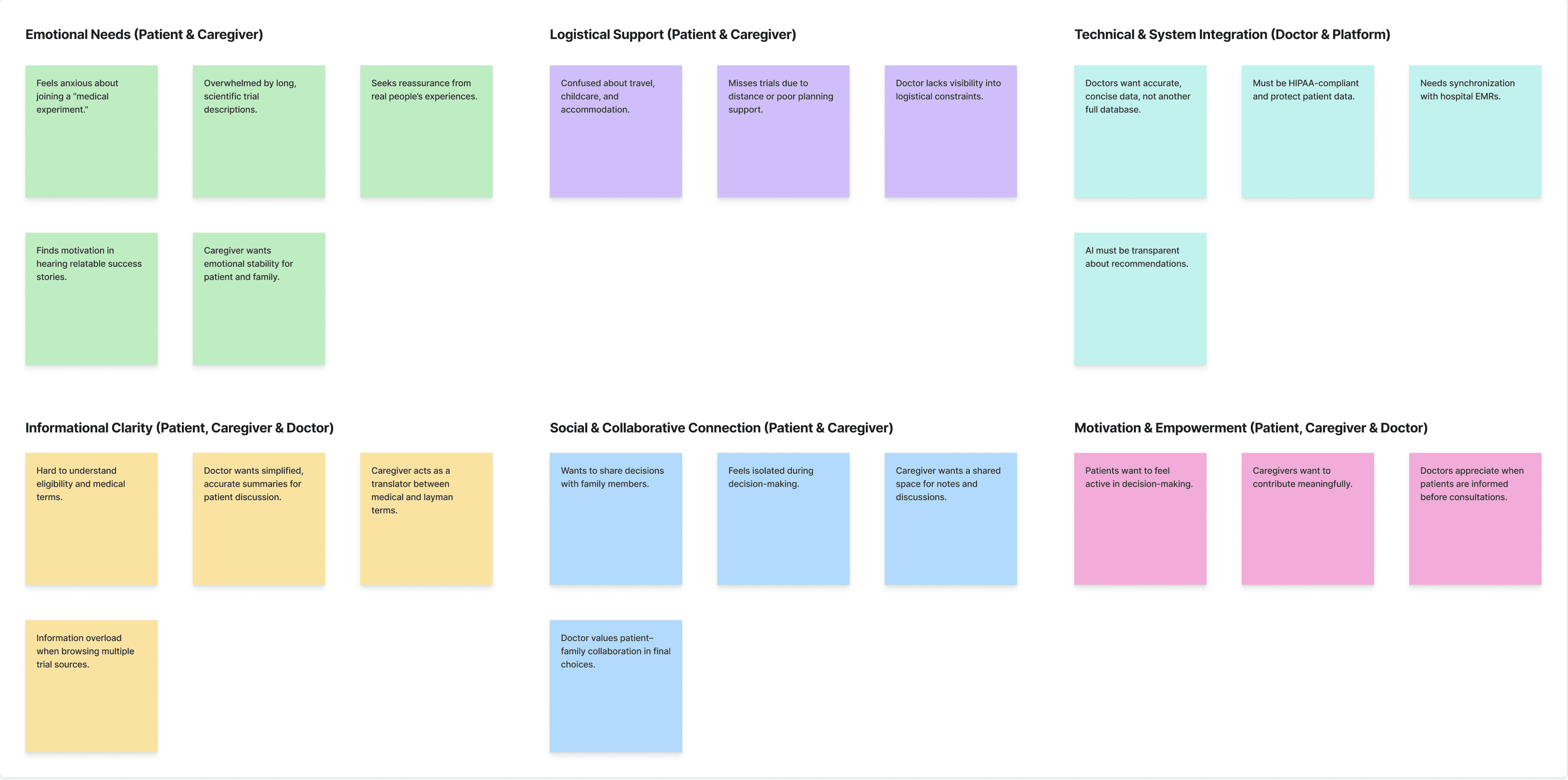
Affinity Mapping
This produced:

01
- Guided journey platform
02 - EHR Integration Clinical Decision Hub
This concept was centered on simplifying the process of discovering clinical trials. As a concept, it ensured a step by step process and the ability to explore, compare, and apply, with elements such as personalized dashboards, trial information, and decision support. The aim of the concept is to improve understanding while allowing patients to make decisions with confidence.

03 - Community Powered Platform
This concept emphasized clinical accuracy and workflow integration by embedding trial matching into electronic health records. These tools were used to support clinical professionals by alerting, automating eligibility determination, collaborating on trial assessments, and managing referrals. They were intended to facilitate easier patient and doctor coordination and enable informed, data-based clinical decisions.

This concept centered on emotional support and social connection by allowing patients to learn from others with similar conditions. It introduced peer messaging, shared experiences, community groups, and mentorship opportunities. The objective was to build trust, motivation, and shared knowledge through real-world stories and community engagement throughout the trial journey.
We had collaborative design discussions through Zoom sessions and in-class with clinicians to validate clinical accuracy, emotional needs, and user flow. We focused on the following four elements initially:
● Distance & logistics as dominant barriers
● Need for clear AI transparency and physician oversight
● Privacy control at every step
● Simplified navigation for overwhelmed patients.


These directly shaped key concept features, including geographic maps, transparent match scoring, and adjustable data sharing preferences.
Three concepts. One unified platform — we explored divergent approaches before synthesizing the strongest elements into one solution.
LOW FIDELITY PROTOTYPE
We created low-fidelity screens that cover the entire patient, caregiver, and physician journey, including onboarding, dashboard, trial details, care circle, education, appointments, and profile. These screens helped validate the information architecture and exposed inconsistencies in labeling, flow complexity, and missing context.
To include the feedback for the above screens, we have restructured the onboarding process to distinguish between basic information and in-depth information for more precise EHR functionality. Additionally, the patient dashboard interface has been reworked to remove illogical workflow steps to place more emphasis on the basic functionality of trial suggestion, filtering, profile building, education pages, and appointments. All of the mentioned improvements have been incorporated into the high-fidelity prototype.
Latest Remarks
Based on the high-fidelity prototypes reviewed, the feedback given was that the onboarding process was too long and daunting for new users. To ensure a less intimidating transition for new starters to the site, the number of questions was reduced to a minimum before being transferred to the trial guide chatbot later in the process. This allowed for a more welcoming transition for new starters to the site.
05 — STAKEHOLDER IMPACT
Our collaboration with physicians from the Mayo Clinic was crucial in aligning TrialBridge with real clinical workflows.
1. Patient Control & Privacy
Physicians also promoted patient autonomy, resulting in complex consent and privacy settings that allow the user to control what information about their health the healthcare providers have access to.
2. Clinically Grounded Workflow
Physician insights revealed the complexity of clinical trials, from eligibility screening and review to informed consent. This shifted the design from an "instant match" model to a realistic, multi-phase process that reflects clinical practice.
3. Data-Driven Onboarding
They also identified the patient information necessary for trial matching. They advised the inclusion of Electronic Health Records for efficiency. All of these measures assisted in the optimization of the process.
Feedback also included improving terminology (e.g., "Suggested Trials" instead of "Matching Trials"), incorporating the strategic utilization of color to accentuate key information.
These learnings helped ensure that the TrialBridge solution acts as a bridge for patients to trial enrollment without complicating the trial process.
TRIALBRIDGE · USER TESTING & ITERATION · DSC 598 · FALL 2025
Five screens.
Three rounds.
Every change earned.
Using think-aloud reviews and semi-structured interviews with Mayo Clinic faculty and clinicians, we identified what was broken and fixed it. Here is the evidence.
01 — ASSESSMENT SCREEN
Travel & Distance
THE PROBLEM
The travel question only allowed a single choice. Patients who were open to multiple travel ranges had no way to express that. The phrasing was unclear and the options felt clinical rather than human.
THE FIX
Redesigned as a multi-select checkbox layout under a clear "Travel Preferences" heading. Added plain-language explanations for each option. Added a "Why this matters" note explaining how distance affects trial access. Single choice became four flexible options.
BEFORE

Figure 8: Assessment Screen Feedback
Single choice radio buttons · Unclear phrasing · No context for why travel matters
AFTER

Figure 9: Assessment Screen Fix
Multi-select checkboxes · Clear labels (local, regional, national, international) · "Why this matters" explanation · Step progress visible
02 — CARE CIRCLE
Caregiver Relationships & Task Priority
THE PROBLEM
The Care Circle had no way to show who a caregiver was in relation to the patient. Tasks had no priority system. A spouse, a daughter, and a best friend all looked the same. Urgent tasks looked the same as low-priority ones.
THE FIX
Added relationship tags next to every caregiver name (Spouse, Daughter, Best Friend). Introduced a color-coded priority system for tasks (Pending, In Progress, Completed). Caregivers are now identifiable at a glance and tasks have clear status hierarchy.
BEFORE

Figure 10: Care Circle Feedback
No relationship labels · Tasks undifferentiated · Priority invisible · Generic member list
AFTER
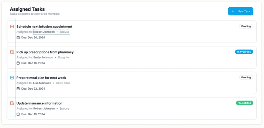
Figure 11: Care Circle Fix
Relationship tags on every member · Color-coded task status · Due dates visible · Clear hierarchy between Primary and Supporting caregivers
03 — COMMUNITY HUB
Privacy Controls & User Context
THE PROBLEM
The Community Hub showed usernames with no context. Patients could not tell who they were connecting with, whether someone was currently in a trial, or how far away they were. Privacy controls were limited to a binary choice.
THE FIX
Added an anonymity toggle so users control their own visibility. Each member card now shows age, gender, distance, and trial status. Added a "Send Request" flow. Integrated an AI chatbot for any questions. Privacy became granular, not binary.
BEFORE

Figure 12: Community Hub Feedback
Anonymous names only · No distance or context · Limited inclusion/exclusion controls · No connection flow
AFTER

Figure 13: Community Hub Fix
Anonymity toggle per user · Age, gender, distance, trial status visible · Send Request button · AI chatbot integrated · Trial-specific community filtering
04 — DASHBOARD
Information Architecture & Visual Hierarchy
THE PROBLEM
The dashboard had inconsistent labels, redundant action buttons, and no sense of where a patient was in their trial journey. "Matching Trials" meant nothing to a first-time user. The layout prioritized data over decisions.
THE FIX
Standardized all headings. Removed redundant actions. Added a "Your Decision Timeline" progress tracker showing all five phases from Profile Created to Trial Enrollment. Renamed "Matching Trials" to "Suggested Trials" on physician recommendation. Added match percentage as a visual cue on every trial card.
BEFORE

Figure 14: Dashboard Feedback
Inconsistent labels · Redundant CTAs · No journey progress · "Matching Trials" terminology confusing · No match score visible on cards
AFTER

Figure 15: Dashboard Fix
"Suggested Trials" terminology · Decision Timeline with 5 phases · Match percentage on every card · Standardized headings · Phase and recruiting status badges
05 — ONBOARDING FLOW
Cognitive Load & Clinical Depth
THE PROBLEM
The onboarding form was overwhelming. Everything was asked at once. New users faced a wall of medical questions before they had any context for why those questions mattered. Completion rates suffered. Clinicians flagged missing inputs needed for accurate EHR matching.
THE FIX
Split onboarding into two layers: basic personal and demographic information first, then clinical depth second. Added "Not sure / Not applicable" options throughout. Added comorbidities field, EHR upload option, and treatment history. Final round reduced even the basic questions to a minimum and moved depth into the trial guide chatbot later in the flow.
BEFORE
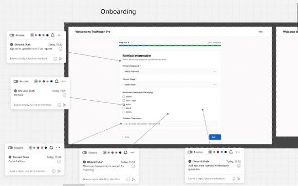
Figure 16: Onboarding Feedback
All questions on one screen · No "Not sure" options · Missing comorbidities and clinical inputs · No file upload · Felt like a hospital intake form
AFTER
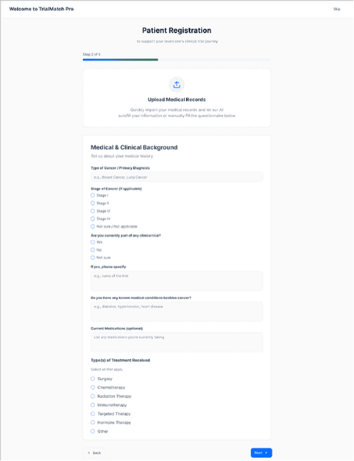
Figure 17: Onboarding Fix
Split into basic + clinical layers · EHR import or manual entry · "Not sure / Not applicable" throughout · File upload for medical records · Minimum questions upfront, depth in chatbot later
Every iteration reduced cognitive load, improved clarity, and strengthened privacy control while supporting both patient autonomy and clinical accuracy.
5
Screens iterated
3
Rounds of feedback
40%
Task completion steps reduced
54→89%
Onboarding completion
05 — HIGH FIDELITY PROTOTYPE
Seven modules. Built to feel like real clinical workflow.
After three rounds of iteration and physician testing, we translated validated patterns into a complete Figma prototype across seven modules — onboarding, trial matching, eligibility review, patient enrollment, consent workflow, trial monitoring, and physician notes.
Every screen meets WCAG 2.2 AA and is designed around EHR-native navigation patterns so the tool disappears into the workflow instead of interrupting it.
High Fidelity Prototype
06 — IMPACT AND CONCLUSION
BY THE NUMBERS
−40%
Task completion steps reduced
54→89%
Onboarding completion rate
3
Mayo Clinic physicians embedded
7
Core UX modules built
3
Design iterations
6
Team members
09 — WHAT IT TAUGHT ME
Clarity isn't just good UX.
In healthcare, it's a patient safety issue.
Physician pushback was the best thing that happened to this project. It forced me to question my assumptions about what "helpful" looks like in a clinical context. I came in thinking I knew what good onboarding felt like. I left knowing that in healthcare, every design decision is also a risk decision.
Human Factors Engineering gave me a framework I now apply to every project — not "does this look good" but "what fails if this is wrong." Designing for high-stakes, time-pressured professionals is the hardest design brief there is. And the most important.
Healthcare UX
EHR Integration
WCAG 2.2
Human Factors Engineering
Stakeholder Interviews
Think-Aloud Testing
Heuristic Evaluation
Progressive Disclosure
THE TEAM
DS
Dhrumil Shah
Team Member
PK
Poorva Kulkarni
Team Member
PV
Priyal Vasaiwala
Team Member
SP
Sanjana Paranjape
Team Member
SS
Sreya Suresh
Team Member
AV
Ashritha Vanam
Product Designer