SPF became a design exploration about confidence. Not just skincare confidence but the kind that comes from actually understanding why you are doing what you are doing.
By combining routine structure, community insight, product education, and progress tracking, the app gives users a clearer path through a space that has always felt overwhelming. The process taught us that good design is not about building features. It is about connecting those features to real user concerns and making the whole experience feel like it was made for you specifically.
The final deliverable was a fully interactive high-fidelity Figma prototype covering morning and night routines, a community review system, product management, AI skin scanning, and a character-based reward system. We also produced a complete YouTube demo walkthrough to communicate the prototype's interactive flows to stakeholders who couldn't click through it themselves. You can watch it at youtube Demo and explore the prototype at figma.
SPF
Studios
CASE STUDY · SPF STUDIOS · IND 494 / 598 · DR. KIMI ZHONG
Designing a digital presence and prototype for a creative studio —
brand storytelling through every screen.
Brand Identity + UX Design
IND 494 / 598
Under Dr. Kimi Zhong
UX Designer
& Visual Storyteller
Stephan Bui
Surmeet Gill
Dahye Kim
Figma Prototype
+ YouTube Demo
COURSE
MY ROLE
TEAM
DELIVERABLES

01 — INTRODUCTION
02 PROBLEM
03 DESIGN PROCESS
Skincare is something most people care about but few people understand. Product reviews, influencer recommendations, ingredient lists, sponsored posts, dermatologist advice — the information exists but none of it is organized around you specifically.
Our team designed SPF — Skin, Purpose, Feel-Good — an all-in-one skincare app built in Figma that replaces guesswork with personalized guidance. Research grounded in user interviews and competitive analysis. Delivered as a high-fidelity prototype with a live YouTube demo and interactive Figma prototype for stakeholder review.
Skincare Research — 2024
Problem Framing
The Problem Space
Skincare shouldn't be guesswork.
Through early research, we found the issue isn't only product discovery — it's about trust, routine-building, education, and motivation.
4 core challenges
73%
buy on recs alone
01
Guesswork over guidance
Trial & Error
Most people test products until something works — or doesn't. Without a system, this wastes money and risks irritation.
61%
can't find reaction cause
02
When skin reacts, users freeze
Troubleshooting
Isolating the cause of a breakout or dryness is nearly impossible without a log or clear framework.
Active Ingredients
Skin Barrier
Over-exfoliating and harsh cleansers silently damage the skin barrier before most beginners notice anything wrong.
Success metric
The foundation forgotten
82%
compromise the barrier
04
The interaction problem
48%
layer incompatible actives
03
Retinoids, vitamin C, exfoliating acids — each has interaction rules most users never know until their skin reacts.
Routine-building through structured education
Consistency, trust, and visible skin improvement
Design opportunity
Core insight
Users need guidance, not just product lists
Most people approach skincare through trial and error. They buy products, layer them in the wrong order, combine ingredients that conflict, and have no way to track whether anything is actually working. The information exists online but it is scattered, sponsored, and not organized around any one person's specific skin concerns.
The result is wasted money, skin irritation, and routines that fall apart within weeks because there is no feedback, no structure, and no trust in the process.
We interviewed participants about their current routines, how they chose products, what caused friction, and what would make them actually use an app consistently. We also probed interest in AI facial scanning, clinic connections, and skin measurement tools.
Three patterns came out clearly. First, most users relied on social media, YouTube, friends, and online reviews to make product decisions but rarely trusted those sources fully because they couldn't tell what was sponsored or relevant to their specific skin. Second, even users who had routines struggled with consistency forgetting steps, skipping sunscreen, losing motivation without any feedback loop. Third, affordability was a real constraint. Users didn't just want what worked. They wanted what worked within a budget.
These three findings trust, consistency, and cost shaped every design decision that followed.
Research process: User Personas:
We tested both low-fidelity and high-fidelity prototypes to evaluate structure, flow, usability, and visual clarity. Our assumptions about what felt intuitive were not always what users actually experienced seeing the design for the first time.
Low-fidelity testing focused on the Routine and Community pages. Users completed tasks like adding products to AM and PM routines, browsing community posts, and applying filters. The structure largely held up but surfaced clear gaps. Users wanted to reorder routine steps by tapping them. Users were confused about whether product search pulled from their own shelf or a larger database. On the community side, users wanted multi-select filters because skincare concerns overlap, expected product names to link to dedicated pages, and wanted reviewer skin type shown so recommendations felt relevant.

After organizing our research findings, we used affinity mapping to group common themes . The major themes included confusion around product order and ingredient combinations, lack of ingredient understanding, inconsistency in routines, and overwhelm due to too many options and marketing claims. These themes became the foundation for our design problem.

From there, we created How Might We questions focused on helping users structure skincare routines without harmful ingredient combinations, supporting consistent daily skincare behavior through motivation and clarity, and providing transparent product guidance tailored to individual skin needs. We also created an epic that summarized the main user goal: as an individual interested in improving skin health, the user wants to find, organize, and curate skincare products and routines with confidence so they can maintain consistency and measure results over time.

Design Phase: From Research to Ideas
We translated research findings into possible solutions through storyboards, Crazy 8s, brainstorming, sketches, user flows, and sitemaps before touching any prototype.
The storyboards grounded the design in real user situations. One explored how a user maintains a structured daily routine without confusion. Another explored how a user tracks skin changes over time and uses that data to make smarter product decisions. Both scenarios mapped directly back to what interviews told us users actually needed.
During ideation, Crazy 8s pushed the team to generate multiple directions fast without committing too early to one solution. We explored four feature areas: profile setup, routine creation, community page, and product adding. After sketching and dot voting on the strongest ideas, we moved into structured user flows and sitemaps to anchor the design before prototyping.


User Flows
The user flows pushed us to think through how someone actually moves through the app, not just what features exist. The routine flow had to support users who already owned products and wanted to organize them into morning and night steps without rebuilding from scratch. The community flow had to support browsing, filtering, and reading reviews in a way that felt trustworthy rather than overwhelming.
After dot voting on the strongest Crazy 8s sketches, these flows became the structural backbone before anything moved into wireframes or high fidelity screens.

The add product flow needed to help users search for products and connect them to routines
A feature that was added later in ideation was the direct addition of products to individual routines from the Products page


Product page : Assisting users in managing various products conveniently through three distinct categories.
User flow
The sitemap helped organize the app structure. Instead of treating each feature as separate, we had to think about how the app would connect through navigation. The main areas included routine, community, product information, progress tracking, and AI-related tools. This helped us see that the app needed clear information architecture. If users were already overwhelmed by skincare information, SPF itself could not feel overwhelming.
When creating our first low-fidelity prototypes, we focused on the routine and community flows because they felt central to the app and needed testing before moving into high fidelity. The routine flow allowed users to switch between AM and PM routines and add products through search. The community flow allowed users to browse posts, apply filters, and move between general Q&A and product reviews . At this stage, the main goal was to test the structure, flow, and whether users understood what they were supposed to do.
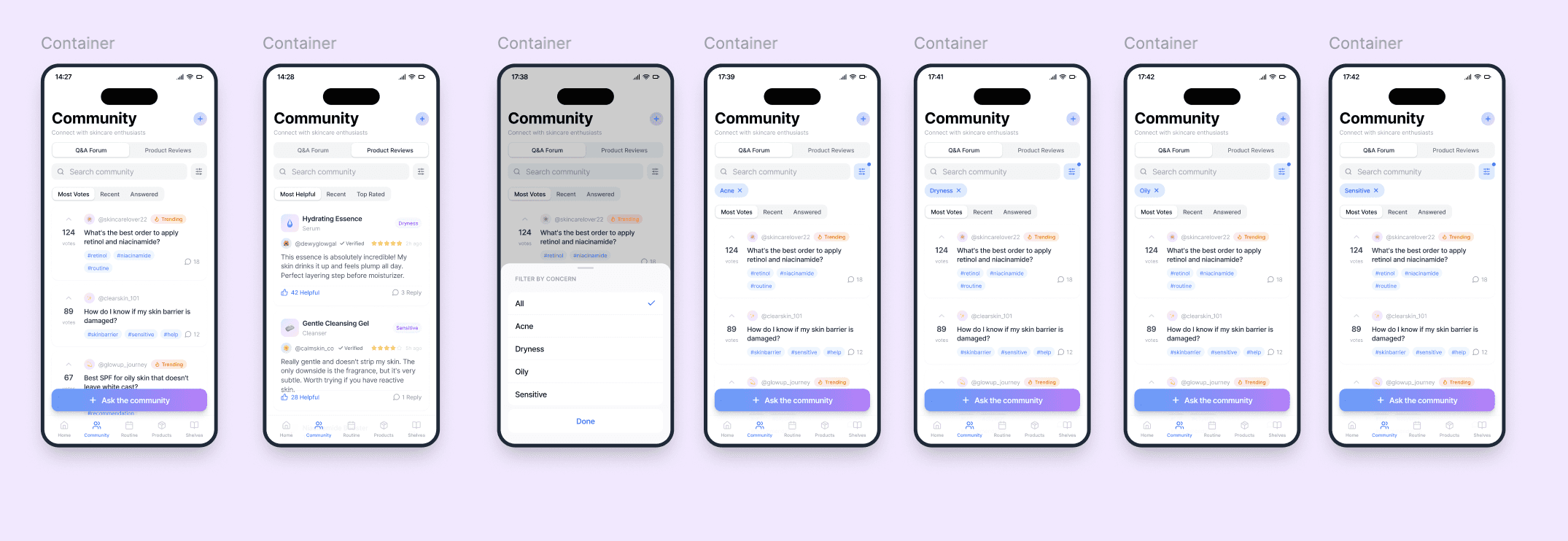
When moving into high-fidelity prototyping, our team focused on turning the routine and while i worked on community flows into a more complete app experience. The routine section allowed users to manage morning and night routines, add products, and view today’s routine . The community section allowed users to browse posts, use filters, and look at product-related feedback from others. These flows were selected because they represented two important needs from our research: personal routine organization and trustworthy community guidance.


Implementation and Test
High-fidelity testing used heuristic evaluation and cognitive walkthroughs to go deeper into visual design, layout, and consistency. The routine section needed categories, clearer captions, a Cancel button, a resized Edit button, and a date picker for routine history. The community page was the biggest challenge. Users liked the features but felt the page looked disconnected from the rest of the app. The pop-up was too dark, information density was too high, and colors were distracting. Shifting to a lighter background with white cards made it feel cleaner and more consistent.
The navigation bar needed text labels under icons because icon-only navigation created confusion about what each section contained.
The core concept tested well. Users understood the value of routine tracking and community guidance. But a feature can be genuinely useful and still overwhelm someone if the layout is too dense or the interaction is unclear. That tension drove every refinement in the final prototype.
04 CONCLUSION
BY THE NUMBERS
7
Core screens
designed
1
Full design
system built
Hi-Fi
Figma prototype
fully interactive
▶
YouTube demo
recorded + produced
4
Team
members
WHAT IT TAUGHT ME
Design is brand storytelling.
Not just screens.
SPF pushed me to think about every pixel as a brand decision, not just a design decision. The difference sounds subtle but it changes everything about how you approach the work.
When you're designing for a creative studio, the UI itself is the proof of concept. If the design doesn't feel considered, the whole pitch falls apart.
The YouTube demo taught me that communicating design is a skill entirely separate from doing design. You can build something brilliant and still lose stakeholders if you can't show them why it works.
SPF was the project that made me think seriously about design presentation as part of the design process itself.
Visual Design Systems
High-Fidelity Prototyping
Figma
UX Storytelling
Stakeholder Presentation
Demo Production
Component Libraries
Brand Identity Design
THE TEAM · IND 494/598 · DR. KIMI ZHONG
SB
Stephan Bui
Team Member
SG
Surmeet Gill
Team Member
DK
Dahye Kim
Team Member
AV
Ashritha Vanam
UX Designer & Visual Storyteller
▶ YouTube Demo · youtube.com/watch?v=Sa5LLktJ9gE
⬡ Figma Prototype · figma.com/proto/zFzUt3Vr7NMzN5lL6d6PF2
PROJECT LINKS
SPF Studios
High-Fidelity Screens
Skin · Purpose · Feel-Good


